


CLIENTZavari was founded by lovers of hot drinks. They have their own chain of coffee, tea and tableware shops, which customers already know well and appreciate for their warm and homely atmosphere. They decided to rebrand to add modernity and soulfulness to their logo (before that the logo had a bit of a technological and outdated look).KEYWORDSMinimalist / Soulful, domestic / Down to earth / Modern
DECISION
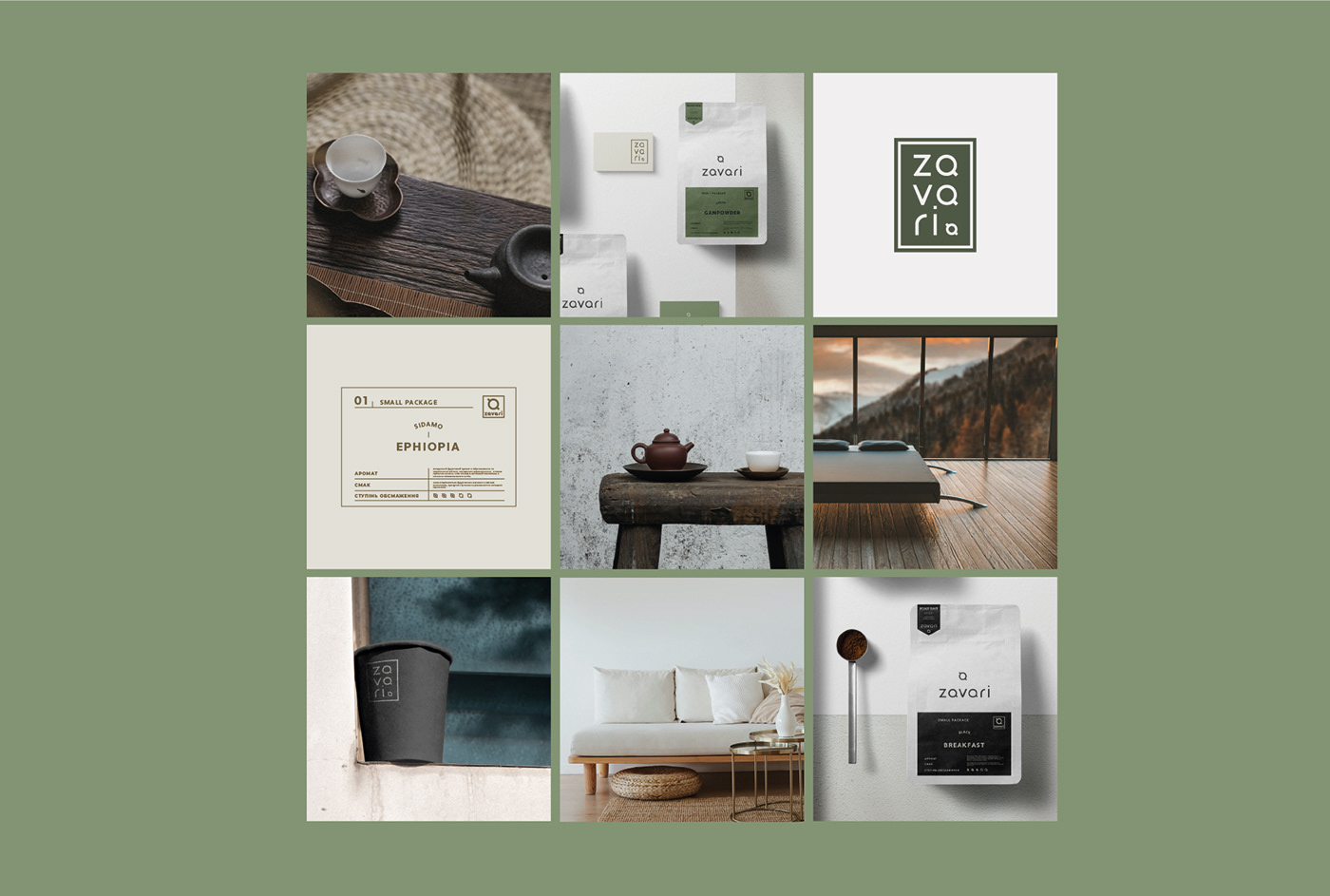
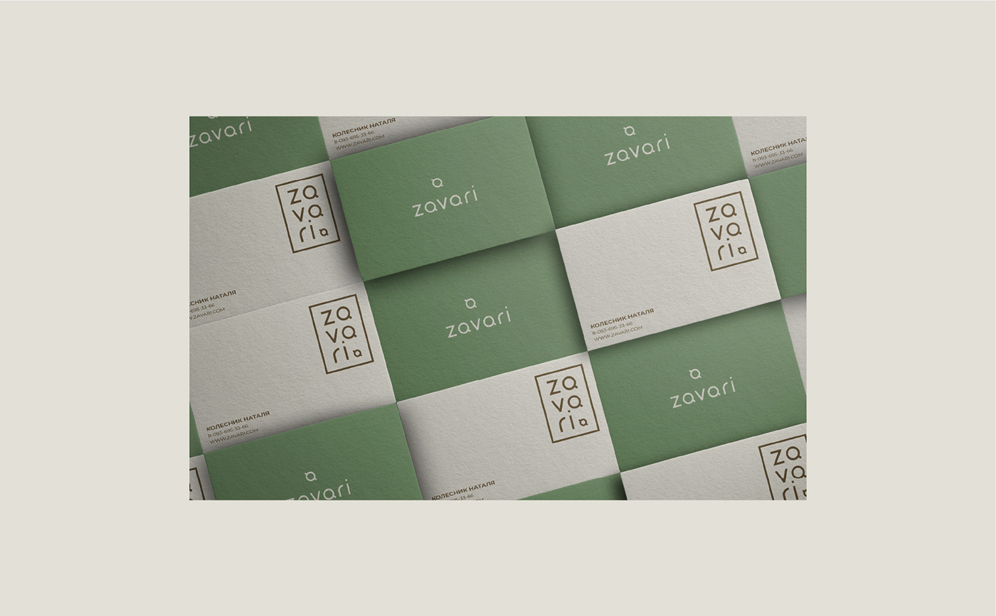
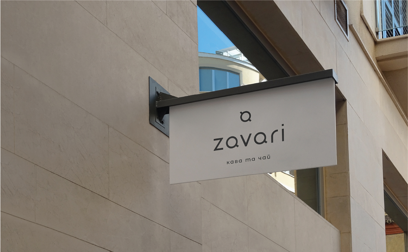
Creating this cup symbol was very exciting because it had to be minimalistic and attractive at the same time. So we came up with this vector illustration of a cup with two handles. One is like a cup of coffee, and the other is tea. For the logo, we used a minimalist font and transformed the A's into a look that supports the cup sign for a more professional feel.
Creating this cup symbol was very exciting because it had to be minimalistic and attractive at the same time. So we came up with this vector illustration of a cup with two handles. One is like a cup of coffee, and the other is tea. For the logo, we used a minimalist font and transformed the A's into a look that supports the cup sign for a more professional feel.
We have also created responsive versions of this logo for different layouts and usage purposes.
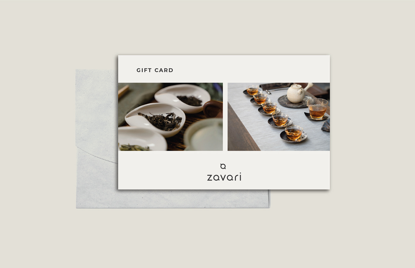
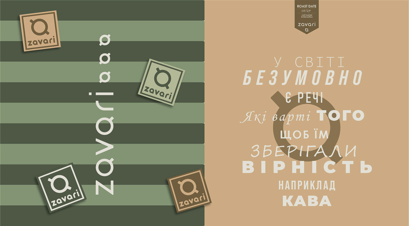
As for the color palette, we chose earthy shades of brown and various shades of green. The colors we have chosen are closely related to nature and organic products.
The packaging design has a light background because of its compatibility with all the colors we have chosen for the color palette. The design of the label differs depending on the types of tea and coffee varieties. At the same time, the layout created by us is minimalistic, clear and clean. It's designed to fit all the important information without overwhelming it.
КЛІЄНТ
Zavari була заснована любителями гарячих напоїв. Вони мають свою мережу магазинчиків кави, чаю та посуду, яку клієнти вже добре знають та цінують за теплу та домашню атмосферу. Вони вирішили провести ребрендинг, щоб додати сучасності та підкреслити душевність у своєму логотипі (до цього логотип мав трохи технологічний та застарілий вигляд).
КЛЮЧОВІ СЛОВА
Мінімалістичний / Душевний, домашній / Приземлений / Сучасний
РІШЕННЯ
Створення цього символу чашки було дуже захоплюючим, оскільки він мав бути мінімалістичним і водночас привабливим. Тож ми придумали цю векторну ілюстрацію чашки з двома ручками. Одна - ніби, чашка кави, а інша - чаю. Що стосується логотипу, ми використали мінімалістичний шрифт та літери А трансформували до вигляду, що підтримує знак чашки для більш професійного відчуття.
Ми також створили адаптивні версії цього логотипу для різних макетів і цілей використання.
Що стосується колірної палітри, ми вибрали землисті відтінки коричневого та різні відтінки зеленого. Кольори, які ми вибрали, тісно пов’язані з природою та органічними продуктами.
Дизайн упаковки має світлий фон через його сумісність з усіма кольорами, які ми вибрали для колірної палітри. Дизайн етикетки відрізняється в залежності від видів чаю та сортів кави. У той же час створений нами макет мінімалістичний, зрозумілий і чистий. Його створено так, щоб вмістити всю важливу інформацію, не перевантажуючи її.


Відкрита до співпраці, розкажу про усі можливі варіанти та допоможу підібрати вигідний для вас формат роботи. Завжди на зв'язку, забезпечую комфорт, спокій та безпеку на всіх етапах взаємодії.
I am open to cooperation, I will tell you about all possible options and help you choose a profitable work format for you. Always in touch, I provide comfort, peace and safety at all stages of interaction.
Дякую за перегляд
Thank you for viewing
Brand designer Jane Vasylenko


